

Comparing Optoma’s UHD65 and the UHD60
Since we first did some direct comparisons a few weeks ago, we have received many requests to compare the UHD65 to the Optoma UHD60. We also received many requests to do a calibrated comparison. We originally were more interested in the new DLP 4K UHD technology – but since many are asking. Here it is.
Key Differences
According to Optoma, the key difference for the $500 difference is the color wheel, contrast ratio, brightness, and motion processing. The purpose of this blog and video is to verify if these differences make a significant and/or a visible difference.
Side-by-Side Comparison
It is our experience to always do a side by side comparison whenever possible. Even though manufacturer’s specifications may give you some idea, we have found that in some cases what is on paper does not always match what the human eye sees. There are many verbal comparisons online and even some labs that test specifications and take readings, but what we are interested in is how they look in comparison to the competition. Here is what we found.
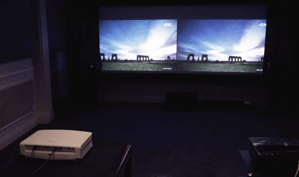
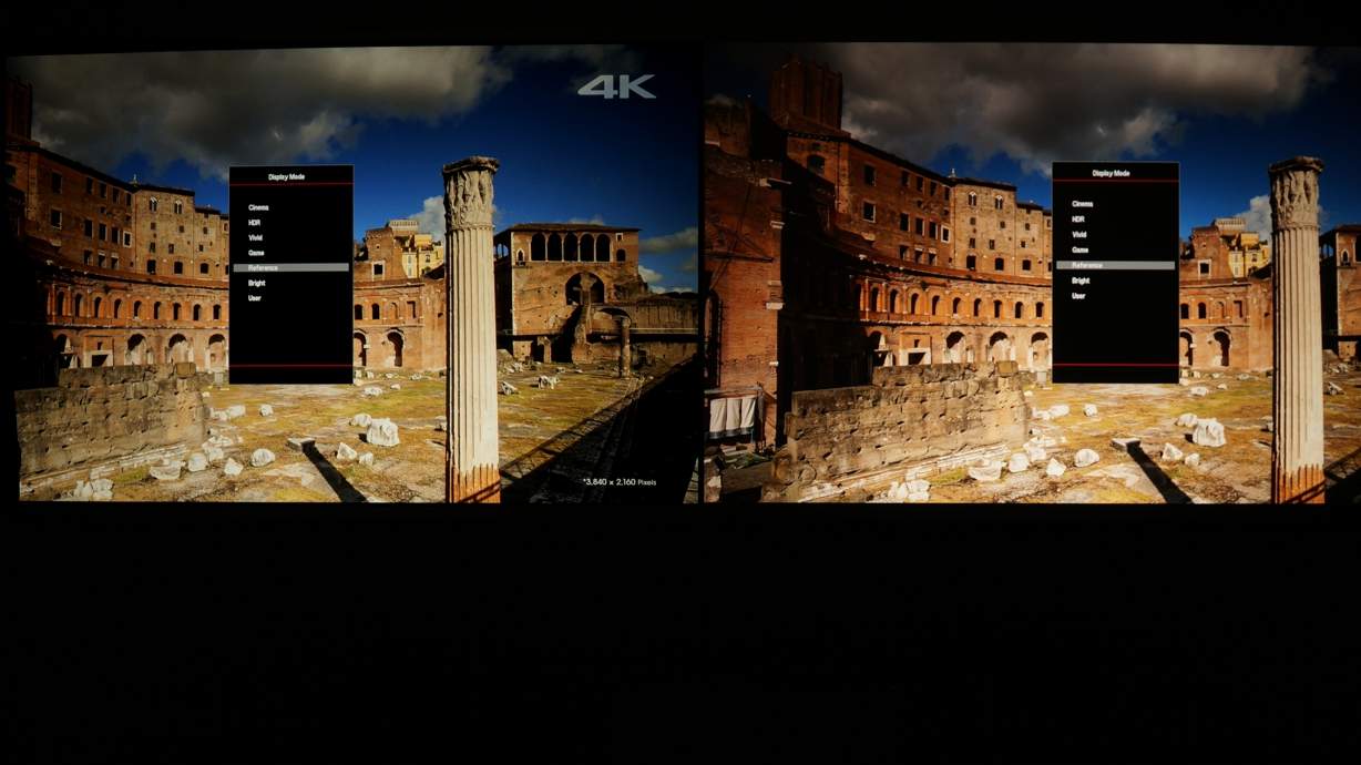
Optoma UHD60 is on the left; UHD65 is on the right. We used the Stewart Studiotek Reference 130 2:35 screen.
Color
All color comparisons should start with a basic setup, even if you’re not doing a full calibration, otherwise you may not see what the projectors are capable of. Ideally a full calibration includes setting the white point or color temperature to 6500 degrees. This is usually referred to as D65. We always recommend full calibration, but realize it may be too expensive for some budgets so here we will show both. Grey scale, a series of black and white bars, is a good indication if the color is close to correct temperature and if it remains or “tracks” the same from black to white. If color temperature is off it will affect color, and especially skin tones, and the overall “look” of the image.
Uncalibrated, or out-of-the box, color temperature should be set by going to reference color mode and choosing D65. This is a great starting point. However most projectors can be improved with a full calibration with instruments and a certified technician.
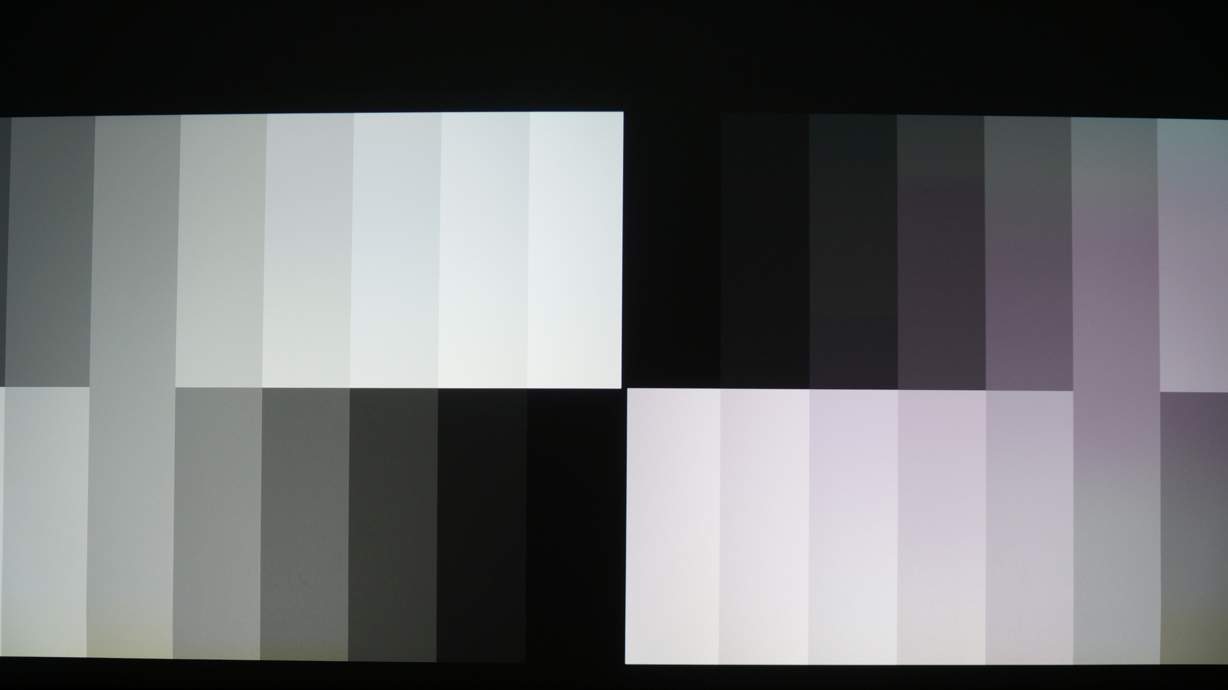
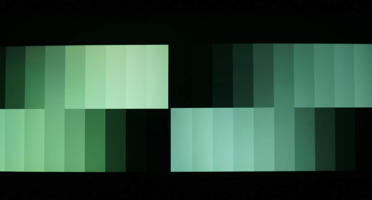
Out of box the UHD60, on left, is slightly green and the UHD65, on the right, is slightly pink.
Once calibrated, as shown below, the greyscale and color reproduction is much closer. The different color wheels make greyscale a little more challenging to match.
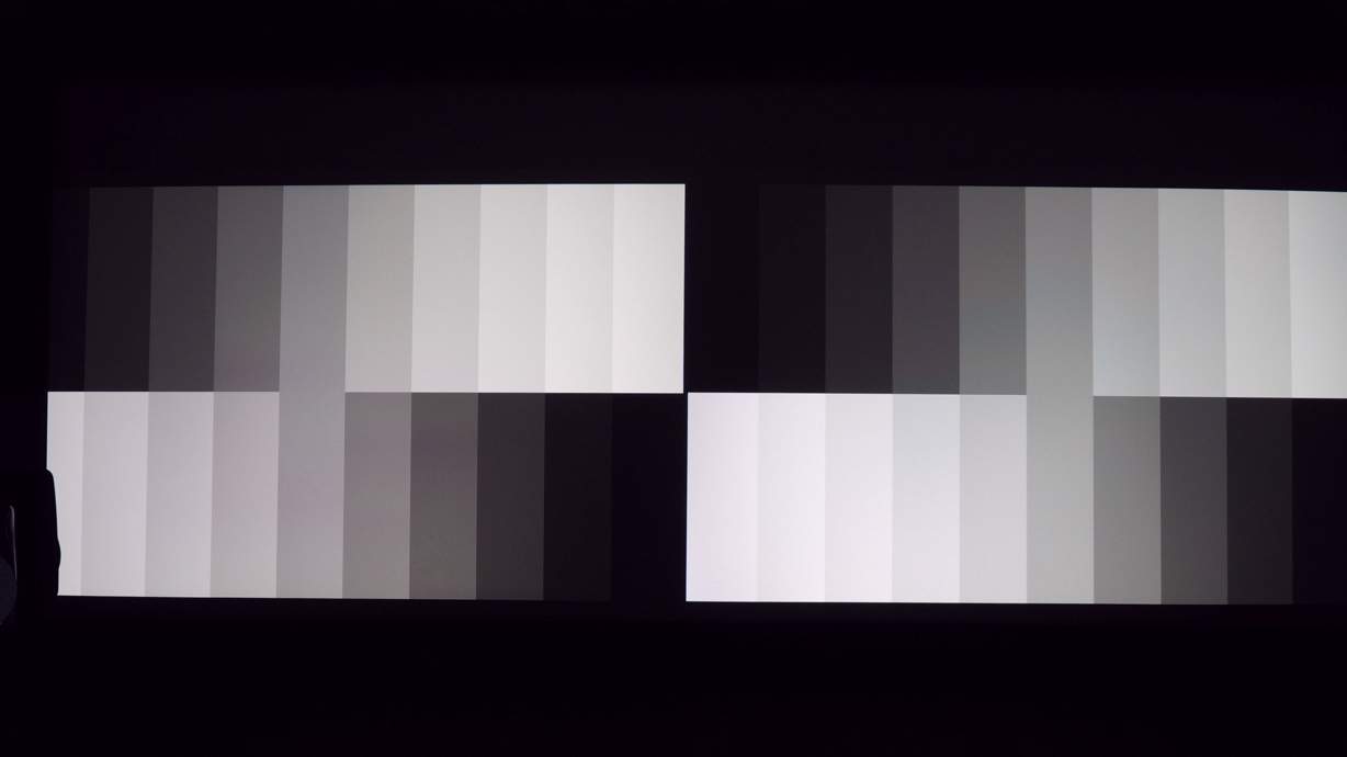
Good greyscale at D65 or 6500 degrees Kelvin is the foundation for good color. UHD60 on left, UHD65 on the right.
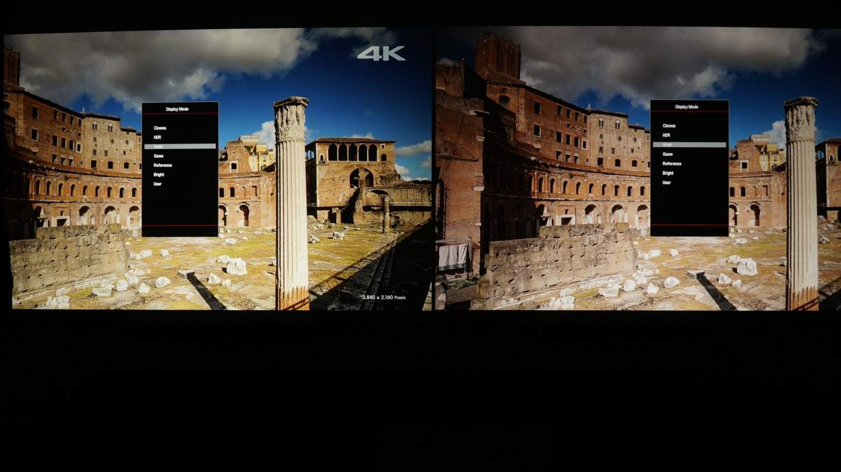
After contrast, black level, gamma, white balance, greyscale, color and hue were calibrated. This is the result.
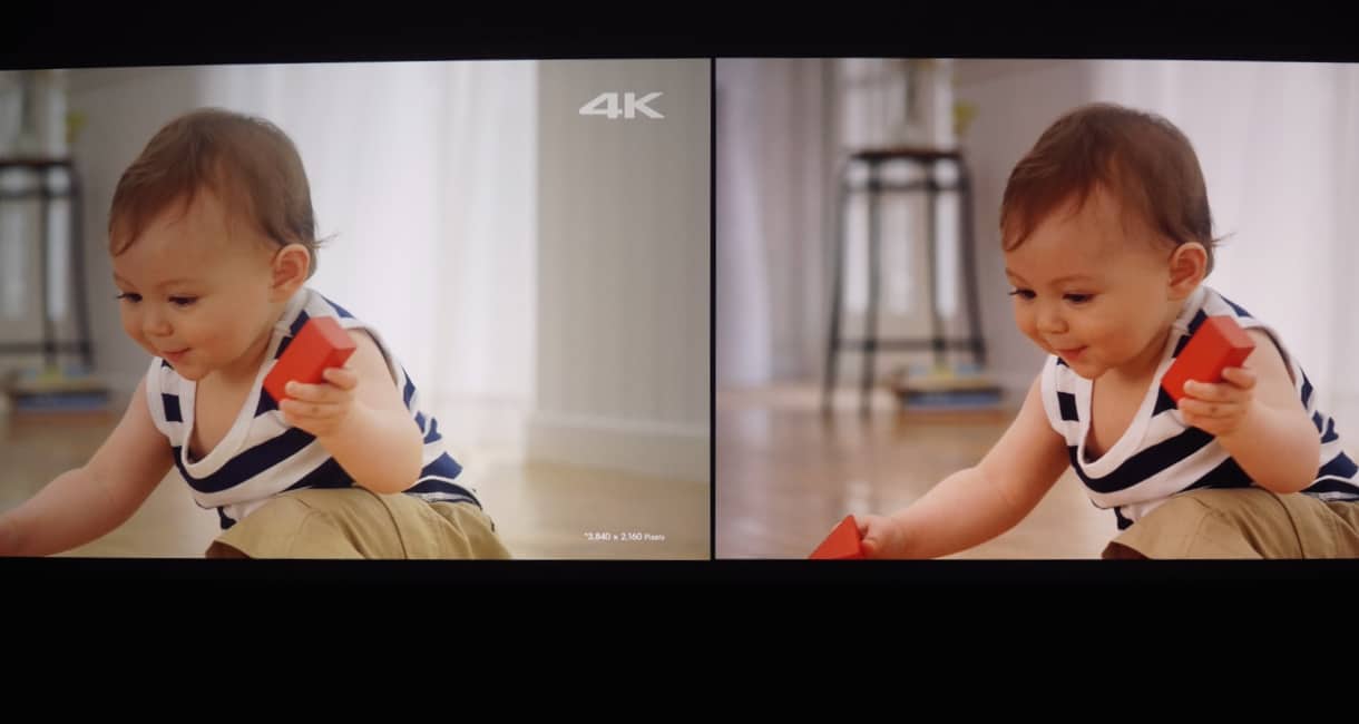
UHD60 is shown on left (with the RGBCY wheel), and the UHD65 is shown on the right (with the RGB/RGB color wheel.
Yes, as expected, there is a difference. The pure RGB/RGB wheel delivers. The color is richer (higher percentage of luminance), more accurate, and results in more lifelike skin tones. The difference is noticeable; however, the UHD60 is no slouch. Compared with many other single DLP projectors, the color is very acceptable for most viewers in reference mode and even usable in “vivid” mode in some applications. Be sure and watch the video to see more skin tone comparisons in both modes.
Contrast
Good contrast is what make an image exciting for me personally – and DLP projectors are known for good contrast. Like many of their competitors, they do vary in their black levels and brightness capability which in turn affects the overall contrast and perception of the image. Once both projectors were calibrated we compared their contrast.
The 4% pluge bar is set so that it is just visible. They are seen just off center of each image above.
Up to this point, the black levels looked very similar to the eye. It was not until we put some good low level images on that we were we able to see the difference in contrast – and it too is significant. Here we reversed the image on the right, which again, is the UHD65 so that what you see in the middle of this picture is both projectors’ images being mirrored right next to each other.
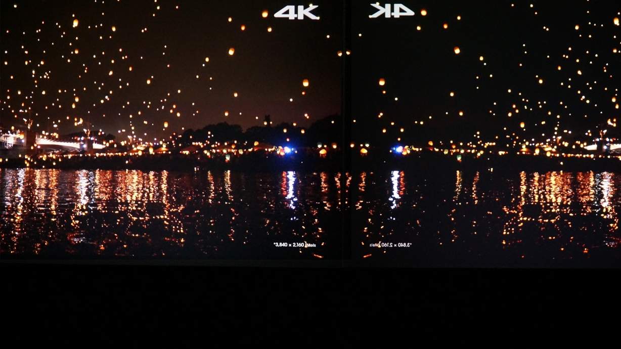
Here, the higher contrast of the UHD65 shows through. And, if you look closely at the skin tone image above, it is very clear that the UHD65 does have improved contrast.
Brightness
The UHD60 is rated at 3,000 and the UHD65 is rated at 2,200 lumens. We’ve found that projectors that have more accurate color, or that can produce better colors, are the projectors with higher brightness. That is the reason for the two color wheels. The RGB/RGB color wheel displays better color but it trades off some of its brightness to do it. Or does it?
Here are both projectors in their brightest color mode called “bright”.
UHD60 is clearly brighter on the left, however the UHD65 is not as greenish/yellow. Both are noticeably green but bright.
Neither projector, in its highest setting, would be usable for quality home theater or even capable of reproducing good skin tones. This is common for many professional projectors because green and yellow light allow the highest readings on most light meters (as well as look bright to the eye, and most lamps provide an abundance of these wave lengths). This is a little more uncommon for home theater projectors, as they are usually a little realistic in terms of more realistic usable greyscale and color. Although maybe usable for say a data-centric presentation or spreadsheet, it is certainly not capable of anything near white or realistic skin tones in this mode.
The brightest usable mode on both these projectors, in our opinion, is the “vivid” mode. It delivers a much brighter image than reference mode but does not make whites and other colors look unreasonable as above.
UHD60 is clearly brighter on the left, however the UHD65 is not as greenish/yellow. Both are noticeably green but bright.
“Reference” mode is another story altogether. This was clearly a surprise for us. When both the UHD60 and UHD65 are put in reference mode they are almost the same brightness – both calibrated and uncalibrated!
In “reference” mode the images are very similar. Note that the color is now closer, but brightness is almost the same – within 10 percent.
Even though the UHD60 is capable of higher brightness, if more accurate color is desired it is about the same brightness as the UHD65 (in “reference” mode) – but it never quite matches the precision of the RGB/RGB color wheel. Nor do you get the better contrast or motion processing. It does mean, however, that for $500 less you can get very respectable color if you are willing to put the projector in “reference” mode at D65 white point.


0 Comments